The Little-Known History of the NFB logo
The Little-Known History of the NFB logo
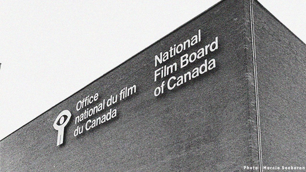
On April 24, as part of our ongoing preparations for the NFB’s move to downtown Montreal, we removed our iconic logo from the outside wall of our current headquarters on Côte-de-Liesse Road.
The logo will eventually be placed in a large public space in the NFB’s new office at Îlot Balmoral.
Installed in the early 1970s along with the inscriptions “National Film Board of Canada” and “Office national du film du Canada,” the aluminum logo has been a fixture of the view from the Metropolitan Expressway for nearly 50 years.
But what are its origins?
In the 1960s, the NFB did not yet have an official symbol. An old emblem with the letters N, F, and B appeared in some of its films from the 1940s, but it was more of an insignia than anything worthy of the term “logo”.
So the NFB’s leadership at the time, headed by Commissioner Hugo McPherson, decided to remedy the situation.
Two graphic design firms were hired, but the resulting proposals were deemed unsatisfactory. So management held a competition among NFB staff on the assumption that employees committed to being creative on a daily basis would come up with better designs.
The logo selection committee received 53 submissions, which were identified solely by number so that the creators’ identities could not influence the jury. Ten designs were selected and submitted to Commissioner McPherson and the committee. They chose, in order of preference, numbers 52, 25, and 9.
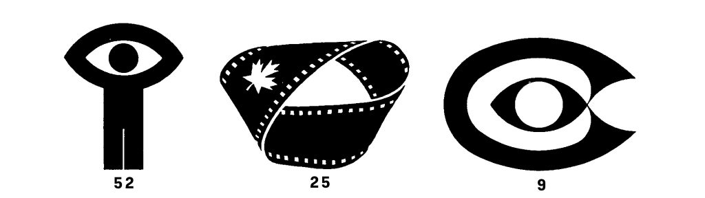
Number 52 was designed by Georges Beaupré, the creative director of the NFB’s publicity department at the time, and it would ultimately become the NFB’s official logo. Submission 25, by celebrated animation filmmaker Norman McLaren, finished in second place; and submission 9, by Sidney Goldsmith, a producer and an animator as well, came in third.
Beaupré’s design, as Commissioner McPherson noted in a July 1970 memo to staff, symbolizes the NFB’s focus on the human being’s vision of humanity.
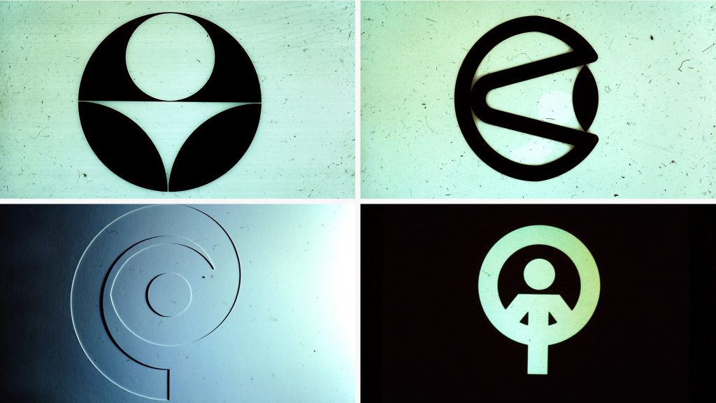
Somewhat remarkably for a time when little thought was given to Indigenous cultural contributions, the logo also evokes Indigenous art. The design, McPherson said, affirmed Canada’s progressive approach to art and communications technology.
“The figure represents mankind. […] The raised arms with clasped hands suggest celebration. The head is like the iris of an eye.” The NFB’s new logo is MAN SEEING. This is visionary man, animated man.”
In 1993 the logo was modified slightly, integrating the design into a frame with the organization’s English and French initials added below. It was further updated in 2002: “Man seeing” moved out of the frame and closer to its audiences, opening up to the world and freeing itself from constraints. The font was changed and a brighter shade of green was used while maintaining its identity.
Finally, in 2015, the colour green was replaced by black.

This is the first time that NFB introduced a new logo since 2002. That logo featured a black square with the visionary man inside it. The text “ONF NFB” are on the left of it, with “NFB” rotated at an angle, while “ONF” was on an opposite rotation angle.
Hi,
It’s great to get a little history about the iconic NFB logo. May I just make a small correction to your comments about the 2002 logo update? The signature or logo box was redesigned so that it could be used in black, reverse (white) or in a fresher brighter shade of green. A new feature was the placement of ONF/ NFB in a way that not one language was predominant. The redesign, by Paprika, a Montreal design firm, garnered many design awards. The on-screen bug (identifier) was subsequently redesigned by the French and English animation studios.
Laurie Jones