This is a guest post from NFB Interactive producer Jennifer Moss.
Paul Shoebridge and Michael Simons are the dynamic creative duo known in the back alleys and coffee shops of Vancouver as “The Goggles.” They are the creators behind the NFBs wonderful interactive documentary about a vanished Canadian town, Welcome to Pine Point, and were brought in by the NFB and Hyperlocal co-creator Sean Embury to lend their design expertise to two of the project’s interactive pieces. Presented with several essays on local change by prominent Canadian writers, they were most intrigued by Will Ferguson’s Garrison Woods and Heather O’Neill’s The Red-light District.
Interactive design borrows a little bit from all kinds of other disciplines: designers integrate music, visuals, text and narration, and create various ways in which users can explore or interact with the work. A project’s interactive elements often underscore or mirror its themes. The adaptation of Will Ferguson’s piece is a perfect example of this.
Ferguson’s essay describes the community of Garrison Woods in Calgary, where the author now lives. It’s a relatively new “planned community,” built on the site of an old army barracks. I asked Paul to discuss the specifics of how he, Mike and Sean came up with the design for the Garrison Woods interactive piece, and how it complements Ferguson’s story.
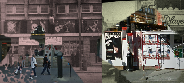
Paul and Mike have a penchant for history and are drawn to designs and stories that reflect the past within the present. Heather O’Neill’s “The Red-light District,” about Montreal’s once-infamous intersection of Saint Catherine and Saint Laurent, piqued their interest right away. The essay relates the author’s memories of visiting this neighbourhood as a child and describes her only link to the way the place looked back then: the deteriorating picture, or “film,” inside her head. Mike told me that they wanted to find a way to capture this notion of a deteriorating image, of fading that occurs with time, in which old images are replaced with new realities. They started by incorporating panoramic images of the street by a Montreal architect, the late Melvin Charney.
O’Neill’s essay also deals with the present day, looking at the transformation of this corner in the newly rebranded Quartier des Spectacles district. In order to properly reflect this evolution in the design of the site, that sense of history found in the 1960s Melvin Charney photos needed a modern ballast. Paul and Mike turned to Google Earth, the mainstay of modern locational graphics.
Finally, once all the images were selected, Sean Embury came up with the idea of applying a unifying “mask,” or layer, of deteriorating film stock over the pictures to create a sense of loss or degeneration. While listening to O’Neill read her piece, visitors to the site can drag a cursor across the photos and morph them in various ways, blending past and present, alternately creating clarity and blurry disintegration, and physically underscoring the author’s central point: that all change involves loss.
Check back for more behind-the-scenes info on the making of the Hyperlocal interactive projects.


