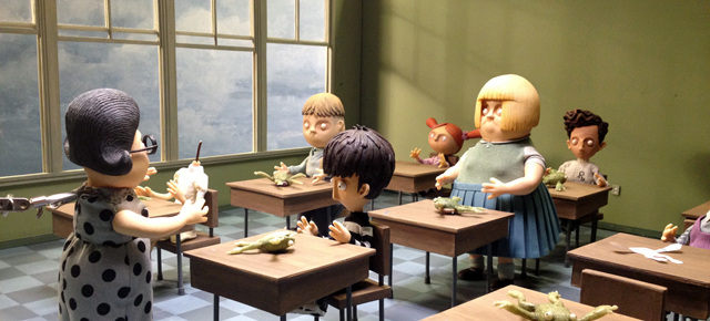
Animation Tips | A Lesson in Character Design
Animation Tips | A Lesson in Character Design
For this blog entry I thought I’d present a sampler tray of various images from the production of my film If I was God, and let you know what I was or wasn’t thinking.
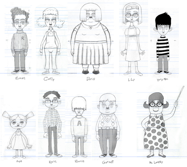
Figure 1, below, is a design line-up of my cast of characters. I know it probably doesn’t look like it, but I found it quite difficult to create the 10 human characters in my film. Though it could have been far worse since there were originally supposed to be 12 kids instead of the 9 we ended up with. Drafting 3 dimensional characters just isn’t something I’ve ever had to do before.
Fig. 1: Character line-up
All the characters in my previous 3 films were generally only designed to be read from a limited perspective. I like the rawness of the characters in my film The Cat Came Back. You can mold the characters and cheat the design to fit whatever angle you are working within each shot. I could have designed a very naive cast of characters, but I needed them to represent real kids and so they needed to have a modicum of human construction and detail. My main goal was that I wanted them to be simple in design. I’ve seen a lot of stop-mo that has overly designed characters and I just find those extra details just too distracting – the design insists upon itself.
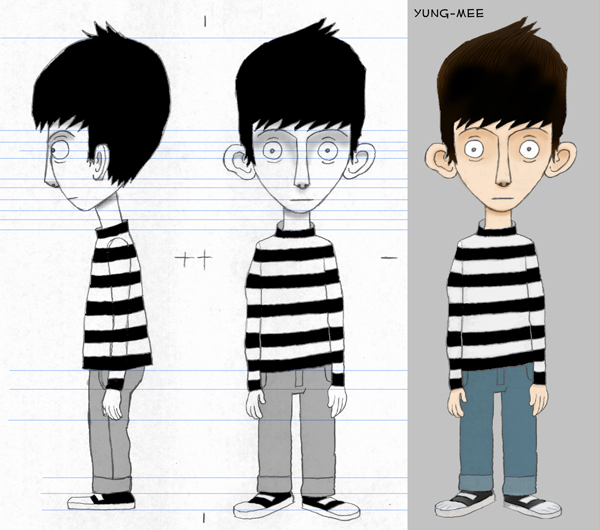
Fig. 2: Yung-Mee design
Here’s the lead character, which is a young me as a 12-year-old boy – hence his working name – Yung-Mee (I would feel silly calling him Little Cordell throughout production). I gave him the classic striped shirt because we see the character (me) in different animated forms throughout the film and I wanted an easily recognizable geometric pattern to ensure the audience can instantly spot that it’s Yung-Mee in each different style. I also gave my character a fairly blank expression so that I could recognize him as how I remembered myself as a very quiet stunned 12-year-old.
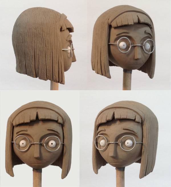
Fig. 3: Lily clay sculpt
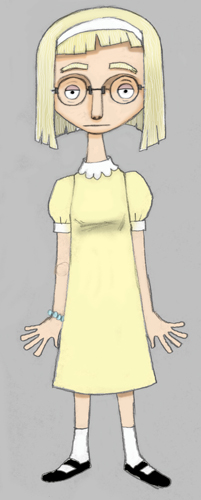
Above is a clay sculpture of the design of Lily, the object of my 12-year-old’s affection. I love these unpainted designs where everything is monochrome. There is something truly beautiful in the simplicity of seeing only the form without any colour information to complicate the impression. I wanted Lily to be both cute and slightly homely at the same time. After all, it’s grade 7 – it’s a pretty small pool from which to single out your 12-year-old point-of-view obsessions. She just needs to be the most attractive of a limited choice.
Fig. 4: Lily colour design
Laurent Canniccioni of the Studio Jako Lanterne would take my colour sketches (along with a profile view) and lovingly, meticulously sculpt each character. I would sometimes make slight suggestions of change, but very few. The sculpts would turn out pretty much exactly as my drawings. Laurent would, of course, have to make some adaptations to realize a 3-dimensional sculpt from 2 views of a flat character drawing. Fascinating stuff!!! I love working with my hands, and so this kind of craftsmanship really appeals to me.
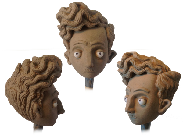
Fig. 5: Roman clay sculpt
Here’s the finished sculpt of Roman – the inevitable 12-year-old male that is waaaaay more mature than every other male in the class – especially me. Note the indications of a budding moustache.
Fig. 6: Dale Hayward
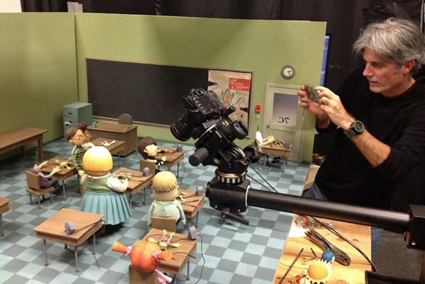
And speaking of budding moustaches, here’s a pic of Dale Hayward, my stop-mo animation supervisor, fiddling with Ms. Lempky (the teacher).
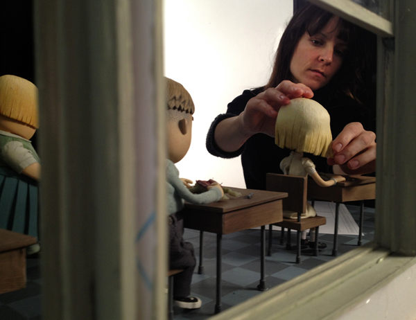
Fig. 7: Sylvie Trouvé
And here we have the wonderfully talented lead stop-motion animator Sylvie Trouvé as she tweaks the hair on Lily.
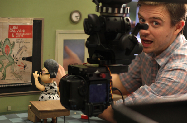
Fig. 8: Cordell
A shot of me from when I was in Montreal working with Dale Hayward on positioning the characters in the classroom and setting up the camera framings for each shot in my film. The camera sits on a special arm, attached to an animation camera rig. The set is far from ready to shoot at this stage. It still needs posters on the left wall, shoe-box dioramas on the far left table, a volcano, chalk lines on the blackboard and the general detritus and debris of a classroom. I’m standing where the wall that contains the giant windows of circa 1968 will eventually be placed (big sky views were a vanishing feature past this era). The astute viewer will have noticed that some children’s heads are missing. Metaphorical???
PS. Next blog will probably focus on set design, puppet armatures, more finished human characters and possibly some non human characters (also the cast of real people who’ve helped work on creating this project).

Hey,.. I like your blog..Nice sketches..and sculpting work is really good.Thanks.
http://www.gameyan.com/
Hey Cordell how are you doing, like your blog..
Cordell, as always, I love your descriptive style and sense of humor. You, as a 12 year old boy, is quite the frame of reference. Good luck in your new endeavors
Congratulations. I´m studying animation and i really appreciate this very helpfull tips. Thanks
Enjoyed the fresh new look of this stopmo film! Awesome!
Great documentation of characters! 🙂