Art and Design: The Process for Claire Blanchet’s “The Interview”
This guest post was written by Claire Blanchet, director and animator of the latest Work For All film, The Interview.
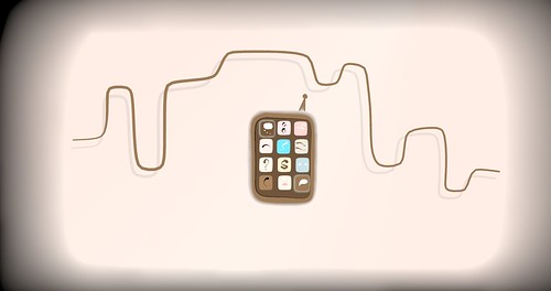
I loved Jean-Hervé Désiré’s concept for the film, rooted in the discrepancy between what’s being thought and what’s being said. I wanted to illustrate this concept through icons in some way, since the film takes place in a smartphone/mobile technology company. I decided to try integrating some iPhone app-type icons into the design of the film’s characters and setting.
As I started working with the icons, I found myself developing a colour palette. At that time, I was aiming to make a black-and-white, text-based film, but I thought I’d try out some colour for the icons. I had a lot of reference photos and started pulling colours inspired by human skin, lips, hair and eyes.
As the colour palette grew, I was surprised to find my mind wandering to my grandparents’ house and to a card my friend once gave me. It suddenly occurred to me why: The palette I was developing recalled 1950s colour schemes… 1950s design. I started thinking
about the limited animation style of that period, the aesthetic tradition of training videos and the fact that many films made in that era illustrate overt barriers around race, sex and class.
With all that in mind, I focused on the design of the characters’ faces. I thought about the endless variations of shape, colour, and proportion in human faces. So beautiful. I would have loved to start working on naturalistic rendering, but to create one minute of
naturalistic animation in our time frame was not so realistic. In any case, my intention at that moment was to design a face based on icons – something less naturalistic and more geometric.
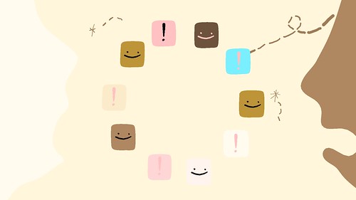
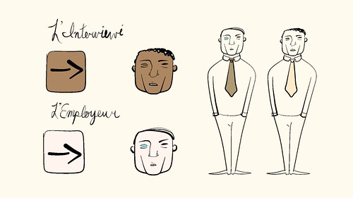
In Understanding Comics, Scott McCloud‘s classic book on visual communication in comics, McCloud has some brilliant stuff to say about iconic design. This also added clarity for such a short film: a controlled experiment, the characters are dressed the same, about the same age, size, etc., but are different colours. Based on this particular difference, the employer begins to formulate a chain of wildly absurd assumptions about the interviewee… while the whole “job interview” thing slips his mind completely.
But my first design was too child-like for the subject matter! The film needed a more off-putting, sinister tone. I spent that morning poring over author and historian Amid Amidi‘s amazing book Cartoon Modern, and I also looked through books on cubism, Joan Miró, and Alexander Calder. I filled a lot of pages in my sketchbook with designs that didn’t work at all, and was planning to storm out of my house, thoroughly discouraged.
As I was putting on my shoes, my eyes fell to a book about Modigliani. He was inspired by ancient Egyptian and African art, and I’ve always been in love with his figures and their hollow eyes. Sometimes, each eye is a different color. Then, I found a quote about this haunting painting, Portrait of Leopold Survage:
Modigliani justified giving the sitter only one “normal” eye by explaining, “With one eye you are looking at the outside world, while with the other you are looking within yourself.”
Oh, I thought. Gotcha.
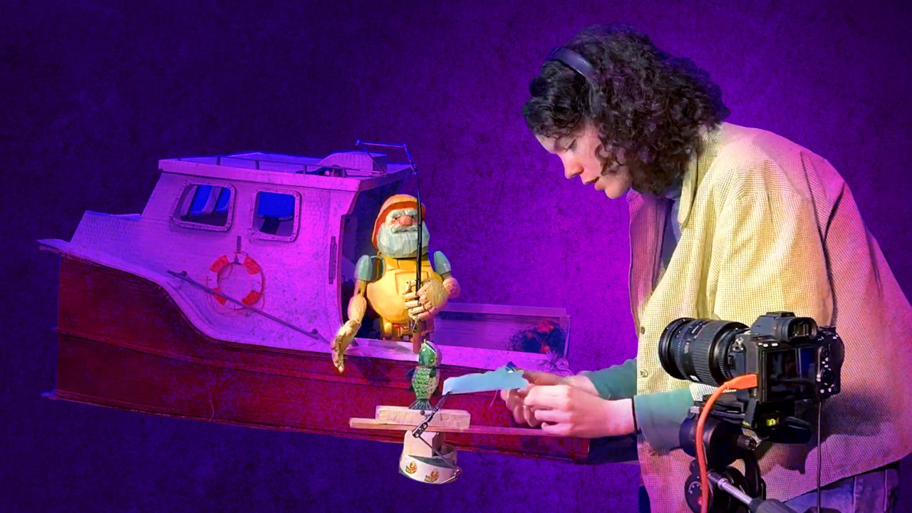
Be sure to check out Hothouse filmmaker Greg Labute’s recent post on NFB.ca to learn more about Sandde, the stereoscopic drawing and animation device used to create The Interview.
Great colours & design!